
It is a common experience of many web developers to come across the dilemma in facing the choices of the dark user interface and the light user interface. While each one of them has their particular advantages, choosing one blindly and without prior considerations of the reactions of the audience can make the interface suffer from low engagement and a drop in business conversion.
Apart from the aesthetic point of view, here through the length of this post UI/UX designers, we are going to explain a lot of other aspects, starting from the user engagement, and business conversion to the long-term push for user loyalty.
Explain Different Factors
Before getting into the discourse of making a choice between the light and dark interface we need to explain several factors that explain the key benefits of each color scheme.
There are obviously a whole array of colors to choose for your user interface. Making a choice among these color options is what is important for the user interface to gain traction and engagement. It is the appropriate color scheme with which your decision to opt for a specific user interface starts. Let us explain in brief some of the key factors to choose your color scheme.
- Clarity: Your user interface must look clean and well organized to show all on-screen visual elements. It requires proper contrast, the least cognitive load, and a lot of white or negative space for the eyes to settle down. The clarity and legibility of the Call to Action buttons are also important for a cool looking user interface.
- Flexibility: The UI’s flexibility will help make the user interface look good across all situations and environments. The classic options such as light-n-dark and dark-on-light will never look outdated.
- Familiarity: The UI elements should always stand out visually to help your brand strike a chord or two in the memory of the users long after they have left the interface. Once they get familiar with your interface, driving traction will become further easier.
- Accessibility: All users do not have the same kind of eyesight and visual perception and so, you need to ensure that irrespective of any differences in ability all users can access your mobile app UI elements and engage with the contents in equal measure.
- Responsiveness: The last but not least of all considerations will be regarding the responsiveness of the user interface for all types of device screens. Your user interface must look equally appealing and useful across all sizes and types of device screens.
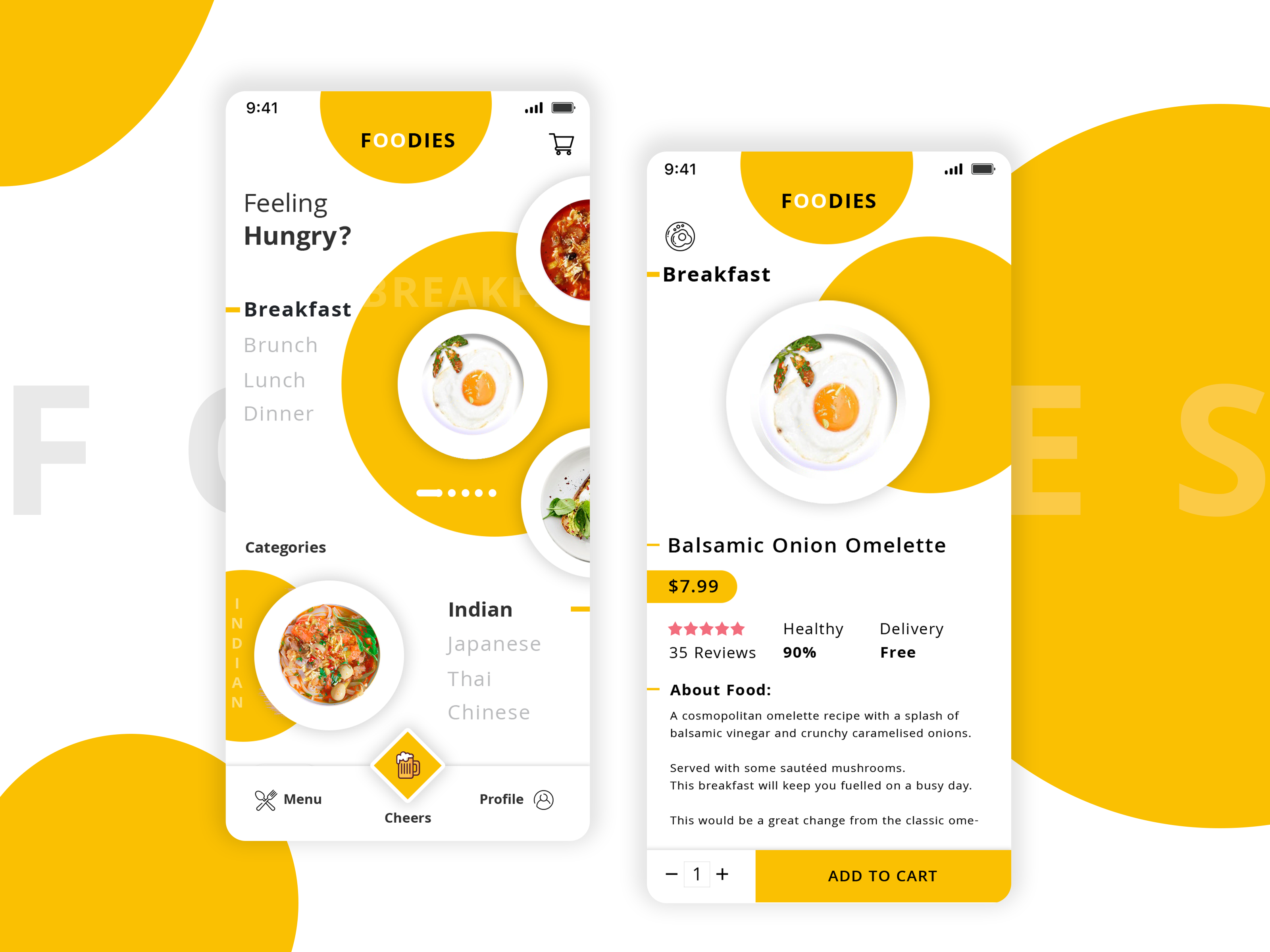
Pros And Cons Of Light UI
No user interface option can be referred to as the ultimate solution for all types of websites and their audiences. Generally, light UI has its equal share of pros and cons.
Let us begin with the pros of this UI followed by the specific cons.
Pros
- Great for a simple and user-friendly design.
- Optimised for better readability.
- More familiar and conventional across most user interfaces.
Cons
- Looks dull and commonplace at times.
- Not enough innovative and attractive.
- May not be appropriate to create a striking appeal.
Now let us see when we need to use the light UI.
- Light UI is good for daytime and natural light viewing.
- It is appropriate in websites with a focus on text content.
- It is also good when the website needs to deal with a lot of visual elements.
- It is good when you use flat design with appropriate colour hierarchy.
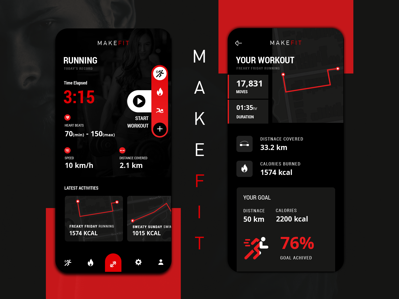
Pros And Cons Of Dark UI
Just like light UI, dark UI also has its fair share of pros and cons. Let’s have a brief look at both sides.
Pros
- Looks attractive and appealing at a glance.
- Offers a shift from the commonplace light UI.
- Great for boosting readability with a striking contrast in low-light condition.
Cons
- Can seriously be compromising for ease of access.
- Can be less-optimised for readability.
- Can lead to compromise on easier engagement.
Now let us see where the dark UI fits best.
- User interfaces with little or negligible text content.
- User interfaces with more emphasis on images, video and graphics contents.
- Intuitive interface with fewer buttons and navigation items.
- User interface showcasing audiovisual media.
- Single page websites with a focus on a single element or content.
Tests With Prototypes

The most important part of making a choice between the light and the dark user interface is to test your interface with the appropriate prototype. Begin with a simple wireframe or sketch with the basic idea. When adding colour to your mock-ups, have several different mock-ups ready with different colour schemes. At last, conduct A/B testing with each mock-up and gain insights about the competitive advantages of each of them.
Conclusion
The user interfaces whether designed with a light or a dark background, needs to be determined as per the context of use and the audience they are meant for. Whether in new app design or when to boost conversions with redesigning, you need to take these things into consideration. However aesthetically appealing and beautiful it looks, it must be useful and effective for the website.