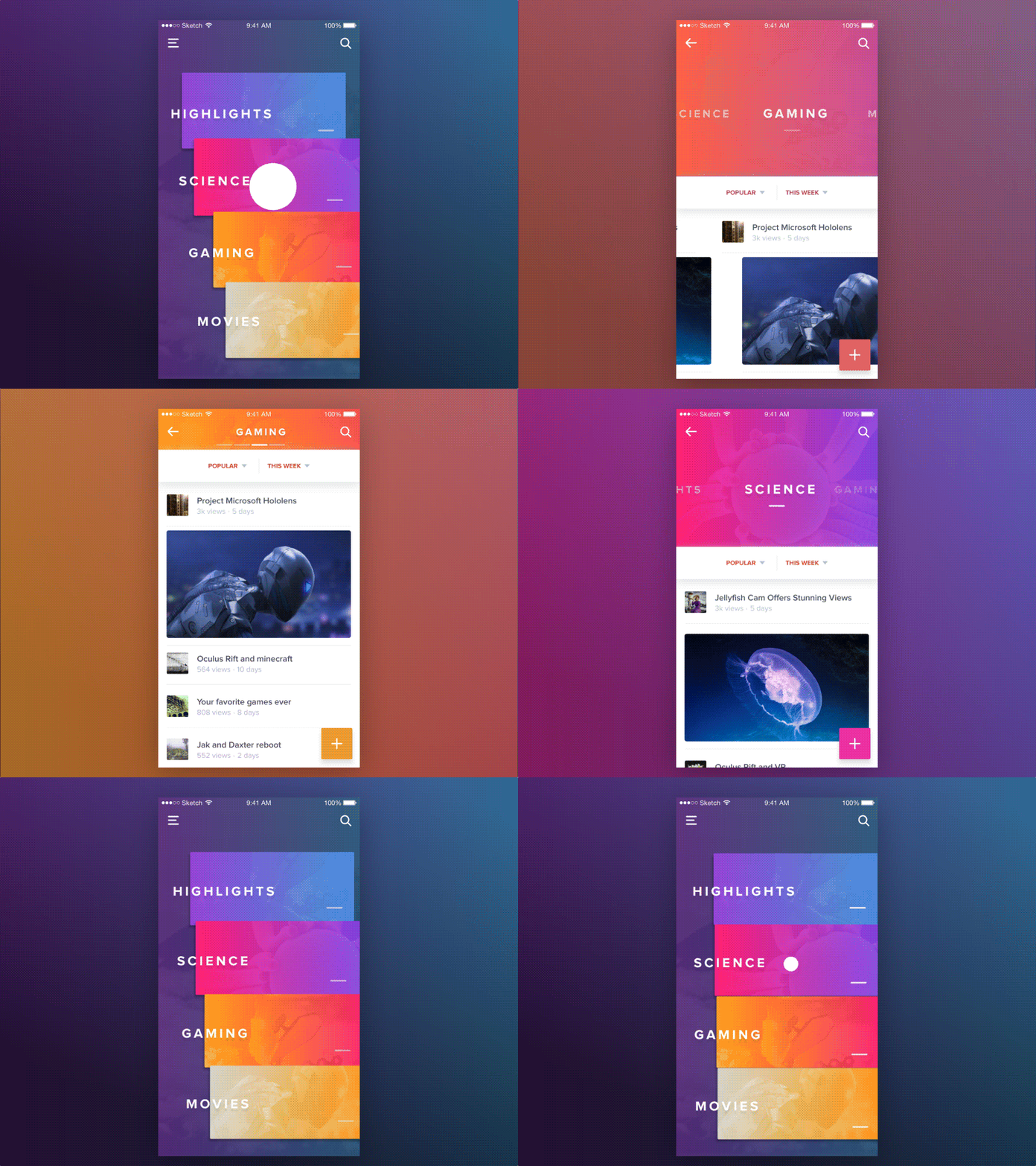
What makes a user download a fresh new app? Is it the sheer purposeful features? Or the refreshing user interface that adds to the usefulness of the app? Well, while the purposeful features give it a concept, the user interface (UI) explains the usability and purpose of the app. The features and interface together make the user experience (UX) of an app and it is the core value proposition. So, without a great UI, the user experience (UX) amounts to nothing.
As the mobile app design is going through a continuous evolution, the future apps demand more sophistication, sharpness, and attributes of quality user experience with UI/UX design. Let us explain the key principles for mobile app UI design.
Every app is like a solution to a problem and the features just work as parts of that solution. In fact, a limited set of features keep your app lean, purposeful and user-centric.
1. Don’t Undermine The Ground Rules
Over the years, some tested and tried practices in UI design stood out. These practices have almost become the ground rules of good design that every mobile app development company indiafollow. These are basic principles without which good UI is never possible. Let us have a look at some of them.
- Don’t make a design with visual clutter or cognitive overload. Enhance the ease of viewing and accessibility with a lot of white space around each element. Use conventional signs or elements that users instantly understands.
- Strictly follow the platform-specific rules and guidelines.
- Keep the design simple and straightforward to allow quick interaction.
- Use the appropriate format for all graphics files. So that the loading speed can be optimized.
- Use graphics that easily fit all types of screen.
- Finally, always do good research before coming to design decisions for your app.
2. Prioritize The Features
If you still consider being “feature-rich” is praiseworthy, you still remain in the first generation of mobile app development. Adding too many features will no longer add to the appeal of your app. Users now look for only the features that they need. Every app is like a solution to a problem and the features just work as parts of that solution. In fact, a limited set of features keep your app lean, purposeful and user-centric.
- Consider launching a minimum viable product (MVP) at first with basic and bare minimum features.
- Always try to figure out the user journey through the app and how the features can help you in getting things done.
- Make the features self-evident to allow them easy interaction without any confusion.
3. Make Navigation Self-Evident
source:dribbble.com
Allowing users to navigate through an app should be the priority of developers. Because all the quality inputs in contents and features have no relevance if the users fail to find them. The navigation should allow users to find what they require instantly. The navigation should be self-explanatory as to tell users where and how to access the contents and functions they require. Here are some key tips in this regard.
- Maintain familiarity to ensure easy understanding of navigation elements.
- Follow time-tested information architecture optimized for allowing access to information with least effort.
- Navigation should be designed to stay clear of the distractions.
- Always allow people to know where in the app they are located while navigating.
- Maintain consistency with navigation elements.
4. Design For The Right Thumb
One of the most compelling truth that UI designers recently started to acknowledge and address is the right thumb navigation. Most people are getting used to using their smartphone single-handedly and while doing so, they scroll and navigate mostly by their thumb. As the majority of users are right-handed, designing the interface to help the right thumb scrolling and navigation now became a necessity. Let us provide some tips to design interface for the thumb.
- Keep the most important clickable buttons, links, and elements for scrolling actions within the right thumb zone on the screen.
- Design buttons and links to allow easy tapping with the right thumb. Leave enough space for a correct tap on the buttons.
- Keep the most important details and buttons above the fold.
- Maintain the design for the Thumb Zone across all pages.
A balanced contrast and symmetry of colors cannot only achieve aesthetics but can also be used to create the right kind of impression.
5. Meaningful Use Of Colors
Colors are not just visual elements to grab attention and boost the aesthetic beauty of the interface. Colors are equally meaningful and refer to different moods and purposes. One should use colors very diligently and as per the color science. Colors can also be used to create a sense of priority.
source:dribbble.com
- Use color as per color theory and ensure that it matches the mood of your app niche.
- The transition of screens with fading colors is another way to take users from one screen to another.
- Change if button colors with clicks is another way to refer to actions.
- Tonal changes in color blocks and buttons can also create a sense of priority.
- A balanced contrast and symmetry of colors cannot only achieve aesthetics but can also be used to create the right kind of impression.
6. Genuine High-Definition Images
Images are invincible parts of a visual design. As the attention span of users is steadily decreasing, high-quality images are becoming more important to convey the message more speedily and sometimes, even with a fleeting glance. Let us provide some tips for using images.
- Always try to use genuine photographs and fresh graphics produced in-house.
- Always use high-resolution images with an aesthetic appeal and relevance for your niche.
- Use vector-based images to allow scaling up easily as per the required resolution.
7. Opt for Beta Testing With Unknown Users
It has been a common knowledge that the developers are not very efficient when it comes to QA process. This is why when the app is ready for the launch, it is better to test the app with unknown users having no idea about the objectives of the app or how the interface design works. Here are some useful tips.
- For testing your product choose a mixed audience of smartphone users representing all walks of life.
- Broaden the circumference of queries to accommodate all the issues, shortcomings and dissatisfactions while using the app.
- Evaluate the time required to access the key features and contents by users individually.
The above-mentioned principles have not only stood the test of time, but they have played a crucial role in shaping the success of many mobile apps. These principles and practices will help your app become more useful, relevant and user-centric


