





Quick Summary: Looking for actionable user experience tips to improve your mobile app and reduce churn? A successful app depends on user-friendly navigation, decluttered interfaces, and design for the physical constraints of mobile devices, such as the “thumb zone.” By following official OS guidelines and prioritizing readability, you can significantly reduce app abandonment and boost long-term user retention.
As smartphone use becomes even more popular worldwide, providing a great mobile interface is not just recommended, but essential, as it is how users stay engaged. According to some industry standards, about 25% of users will stop using an app after a single difficult-to-use experience. Market research featured in the Statista App Retention Report shows that 1 in 4 users do not return to an app after a single use.
We at CMARIX have seen how poor layout optimization can cause users to uninstall your app instantly. The user anticipates a hassle-free experience from the very first second of using your app. Be it an iOS app or a cross-platform app, use the correct user experience tricks and make your application growth-ready.
Essential User Experience Tips For App Design
1. Focus on User-Friendly Navigation
Application navigation is the map to guide your users. Overlapping menu categories and unclear button labels will decrease engagement. From our experience in design agencies, good navigation depends largely on predictability and patterns.
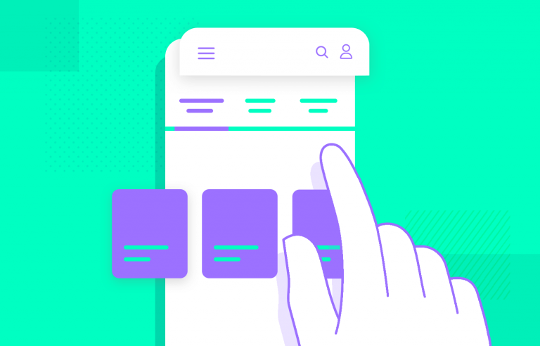
- Use Established Patterns: Do not create something new where you could use an existing pattern. For instance, Kibii uses a side navigation drawer pattern well, and Uber Eats excels at bottom tab navigation.
- Eliminate Jargon: Label buttons clearly with action-oriented, easily understood text. If a user has to guess what a button does, the design has failed.
- Never Hide the Menu: Core navigation elements must remain visible. Ensure users can always find their way “back” with a single, obvious tap.
Read More: Key Elements of Onboarding and Navigation in Mobile App Design
2. Declutter the UI for Maximum Focus
There is far less space on mobile screens compared to desktop screens. Cluttering the screen is the biggest hurdle in modern-day UI design. Users experience mental overload when their screens are cluttered with random images, excessive text, and buttons.

- Embrace Minimalism: Aim for one or two primary actions per screen. Keep headlines and body copy absolutely concise.
- Leverage White Space: Purposeful use of negative space guides the user’s eye to the most critical elements without visually bombarding them.
- Simplify Your Palette: You should never use strong color contrasts on the computer monitor. Utilize your main colors carefully and select easy-to-understand icons.

3. Optimize Readability for Mobile Scanners
Mobile users rarely read every word on a screen; they scan for keywords and phrases. Condensing desktop-level information into a small mobile interface requires ruthless prioritization.
- Prioritize Critical Content: Display the most important information first. The Medium iOS app is a perfect case study for this, stripping away visual distractions to focus on pure reading accessibility and typography.
- Design for Weak Connections: Create your content so that the key message is clear in the event of a sudden loss of cellular connectivity.
Read More: Top 7 UI Trends For Boosting The Profitability of eCommerce Businesses
4. Ensure Tap Targets are Finger-Friendly

One of the most common annoyances in mobile app interface design is pressing buttons by mistake because they are too small and too close together. According to ergonomic studies, the adult finger pad size averages out to about 10 x 14 mm.
- Follow Official OS Directives: Always anchor your designs to official native documentation to build confidence and guarantee usability.
- Apple Human Interface Guidelines: Apple requires a minimum hit region of 44×44 pt for all interactive controls to ensure users can tap them easily.
- Google Material Design: Google’s accessibility guidelines state that touch targets should be at least 48×48 dp (roughly 9mm physical size), separated by at least 8 dp to prevent mis-taps.
- Enforce the 10x10mm Physical Rule: Translating these digital guidelines to physical space, ensure your minimum touch targets are at least 10 x 10 mm in physical screen real estate.
5. Master the “Thumb Zone” (Advanced User Experience Tips)
The more each hardware generation increases smartphone screen sizes, the more ergonomic factors have to play an important role in your design. Almost all users operate smartphones with one hand using their thumbs.

- Design for One-Handed Use: According to detailed mobile interaction research by UX expert Steven Hoober, 49% of people rely on a one-handed grip, and a staggering 75% of all mobile screen interactions are thumb-driven.
- Respect the “Green Zone”: Place primary interactive items, such as your main call-to-action buttons and core navigation, within the natural “thumb zone” at the bottom and center of the screen.
- Avoid the “Stretch Zone”: Placing vital, frequently used controls in the top corners forces users to shift their grip, increasing the risk of dropping the device and adding friction to the user journey.
Conclusion
In the end, creating an outstanding application does not mean creating a good-looking interface alone but rather aligning this interface with the real-world needs of using your phone. With almost half of your customers maneuvering one-handed and three-fourths doing everything with the thumbs, it is essential to design keeping the “Green Zone” in view.
This means placing the most used functions where it is easy to reach them with a thumb and keeping the stretch areas away from those activities that require much of the effort. When you are looking to leverage these ergonomic features to create a high-performing digital product, it is time to connect with expert ui ux design services by CMARIX.
What are the most critical user experience tips for new mobile apps?
The most fundamental user experience tips revolve around keeping the UI decluttered, ensuring highly user-friendly navigation, sizing touch targets correctly (at least 44×44 pt for iOS or 48×48 dp for Android), and strictly designing for the physical “thumb zone.”
How do touch target sizes factor into user experience tips?
Properly sized touch targets prevent users from accidentally tapping the wrong button. Top user experience tips strongly recommend following Apple’s 44×44 pt and Google’s 48×48 dp minimum guidelines, which accommodate the average human fingertip and drastically reduce app frustration.
Why is designing for the “thumb zone” a highly recommended user experience tip?
Research shows that 75% of mobile interactions are driven by the user’s thumb, and nearly half of users hold their phones with one hand. Adapting your layout so primary buttons fall within natural thumb reach is one of the most effective user experience tips for increasing conversions and physical comfort.
How does a cluttered UI violate core user experience tips?
Too many details on the screen overwhelm the user, creating an overloaded state. In the current era, when it comes to user experience guidelines, one needs to be minimalist and make effective use of blank spaces on the screen.
Can applying these user experience tips reduce app abandonment?
Yes. Research indicates that about 25% of users leave an application immediately after the first usage session. However, following basic user experience principles would eliminate the barriers and thus make the app more user-friendly.
What user experience tips apply when choosing between iOS and Android designs?
One of the most important user experience tips is to respect native OS guidelines. Avoid forcing an Android Material Design layout onto an iOS app, or vice versa. Familiarity breeds trust, so following the Apple Human Interface Guidelines for iOS and Google Material Design for Android secures a seamless experience.