

Dark themes or templates are highly popular for delivering visually stunning user interfaces. Dark-themed templates used properly can boast of a sense of professionalism and sophistication. Moreover, as dark themes are often rarer compared to the white background in most interfaces design, they easily grab attention and stick to the user’s memory.
For backend development experts, designing dark themed interfaces for admin panels is not as easy as it sounds to be. There are certain rules and constraints that such design needs to follow. Here we are going to explain some of the time tested principles of designing dark themes templates for the admin panel.
8 Best Tips for Dark Theme Design
1. Don’t Use Black
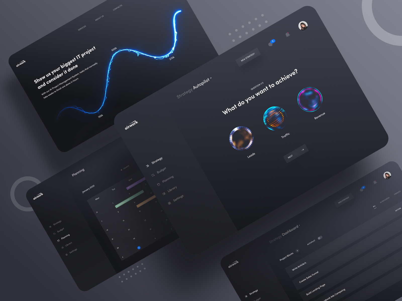
While using dark themes remember that it doesn’t need to be pure black background. Actually, such high contrast can be painful for the eyes. You need to consider other color options that give a dark countenance don’t just fall into any extreme. As a safe option, you can use dark gray for the basic surface color of components instead of using true black. Dark gray or rich navy blue surfaces can minimize the visual strain.
Read More: Block-Based Themes for WordPress
2. Don’t Use Saturated Colors for Dark Themes
The saturated colors that offer a visually appealing look on light surfaces, most of the time don’t look good on dark surfaces. In fact, such saturated colors make the readability of the content suffer when used against a dark background. This is why it is advisable to use lighter tones or colors typically falling in the range of 200-50. These colors offer better readability on the dark background themes.
3. Give Attention to Accessibility
To ensure optimum accessibility make sure that the content becomes easily legible when used in Dark Mode. You must remember that the background surfaces must be dark enough to create the right contrast with the white or lightly colored text. It is safe to follow the standard contrast as suggested by Google Material Design guidelines. According to this guideline, the recommendation for ideal contrast is 15.8:1 between the overlaying text and the background color.
4. Keep Opacity and Vibration in Mind for Text Color

The colors that appear on the foreground elements and used mostly for text should be considered adequately before using them. White is the color that is used widely for text and foreground elements. But pure white in-text can visually vibrate against the dark backgrounds. This is detrimental to the readability and this is the reason why Google Material design suggests using a relatively darker white shade. According to this guideline, the text with high emphasis should use an opacity level of 87%, the medium emphasis text can use a 60% opacity level while text with least emphasis can use an opacity level of 38%.
As additional ways to make your text grab attention, you also need to consider fonts. As light text appears brighter on a dark background, you should always use lightweight fonts for dark mode. To prevent the text glowing with the contrasting dark background, use a relatively darker white shade.
5. Maintain the Emotional Elements of The Design
In case you are designing a dark theme for an app that is already existing, you need to conform to similar emotions through the dark mode or should accentuate it further. But since colors are perceived differently based on their background, you need to be very considerate and meticulous about their emotional effects on the users.
To be precise, a dark theme cannot communicate the same emotion as the light theme. In the vast majority of cases, dark and light themes create different emotional outcomes through design. To boast of the product’s identity or to address the users with the same emotional overtone use dark theme cautiously.
6. Maintain Depth as Required by The Design
Just as it works in the case of light theme design, you need to emphasize the hierarchy and different levels of emphasis with your dark theme UI. These elements of hierarchy and emphasis are brought by depth in the design. There are certainly useful tools to make this happen.
An elevation is a great tool that is often used by designers to communicate the hierarchy of various elements. In the case of light mode, designers generally use shadows for elevation. By this principle, the higher a surface gets, the bigger a shadow it creates. But in case of a dark theme, the approach must be different. If you want to create a shadow against a dark background for the purpose of elevation, you have to illuminate the surface of every level.
7. Shifting From Regular To The Dark Mode
You may want to leave it up to the system to decide on switching on or off the dark mode. But such design decisions can often lead to underperforming user experience. When the system takes a call on the choice of background theme, the users have less control.
This is why it is recommended not to opt for auto-enabling of the dark themes by the system. Instead, give users the control to turn dark or light theme on or off based upon their preferences. Just by using UI control users should be allowed to opt for their preferred mode. For this, you have to provide a mode switcher for the users.
Read More: Key Elements of Onboarding and Navigation in Mobile App Design
8. Test Both Dark and Light-Themed Design
Finally, you need to evaluate how the dark themed and light themed UI appears and you have to adjust the design elements for accommodating elements of different theme backgrounds. Test the app in different conditions such as daylight and night time.
You may like this: How Minimalistic UI Can Help You Turn Around Your Business?
Conclusion
Dark themed backgrounds are increasingly getting popular across apps of all types and niches. No wonder, even mobile OS systems now have come with dark themes for phones. To make your app UI stand attractive and visually engaging you need to use this new trending UI element.