
We are all stuck to our mobile-phones throughout the day. Irrespective of how “social” or “workaholic” you are, from your instagram reels to LinkedIn connections and webinar reminders, you need your smartphone for staying updated about it all. It is no surprise that the world of technology is revolving around “mobile first design” these days.
Businesses wanting to thrive in the online marketplace are acknowledging the importance of mobile-first design. It is no longer optional, but essential, and here is a detailed article that discusses all you need to know about how, what, why, where and other such questions regarding adapting mobile first design.
What Is Mobile First Design? How It Evolved
| Approach | Design Start Point | Philosophy | Optimization Priority | Best For |
| Mobile-First | Smallest screens | Progressive enhancement | Content & performance | Modern, forward-thinking brands |
| Desktop-First | Largest screens | Graceful degradation | Rich features & visuals | Complex applications |
| Responsive Only | Any screen | Adaptation | Flexibility across devices | Simple informational websites |
Mobile-first web design and app design is an approach where skilled UI/UX designers focus on designing their web apps for the smallest screen first, and then enhancing it for larger screens. It’s a design philosophy that literally puts mobile usability and design first, which differs from the traditional design approach which usually optimizes the design for desktop views, and then is optimized for mobile and tablets.
Mobile-first design in the predecessor to desktop-first design and responsive only design. The concept of mobile first responsive web design has been around since 2010, with a few maestros backing it like Luke Wroblewski. Hire UI/UX designers that prioritize mobile-first development with the main focus on content from the get-go. It ensures all important elements receive the prominent attention they deserve, irrespective of screen sizes.
Key Elements of Mobile-First Design
Content Hierarchy
Content hierarchy is one the most important elements in mobile-first web design. Since there is limited screen size, designers need to be very sure of what they want the user to see first. This practice guides better content organization and makes sure the most important elements get the best spot.
Mobile App Navigation
Mobile navigation must be simple yet comprehensive. Hamburger menus, bottom navigation bars, and gesture-based systems have become standard in mobile first website design. The goal is to make navigation intuitive without consuming valuable screen real estate.
Mobile-First Responsive Design
Mobile first responsive web design also needs to be configured in a way that it is functional and looks good on other (bigger devices). It is a mobile-first design best practice to use flexible grids, CSS media queries, responsive images and other tools to achieve this.
Design Progressively
Iterative improvements are important for true mobile-first responsive design. It starts from a solid foundation in mobile experience, and then slowly adding complexity for larger screens. This benefits the entire design since core elements are always strategically placed across all devices.
Avoid Bigger Visuals
Large images and videos that work on desktop can destroy mobile performance. Mobile-first development approaches use appropriately sized media, consider data constraints, and implement lazy loading to optimize visual elements for smaller screens.
Design for Touchscreens
Touch interfaces require different design considerations than mouse-driven ones. Finger-friendly tap targets (minimum 44×44 pixels), proper spacing between interactive elements, and consideration of thumb zones are essential for effective mobile first design.
Effective CTAs
To improve the overall conversions and encourage users to take actions, designers must make sure to design CTAs to be clear, easily tappable and appealing on mobile devices.
Primary Use Cases of Mobile-First Design
While there are many benefits of mobile first design for virtually all digital projects today, certain applications particularly demand this approach:
Mobile-First E-commerce Website Design
Mobile first website design for e-commerce focuses on streamlining product discovery, simplifying checkout flows, and optimizing product imagery for small screens. Successful implementations show conversion rate improvements of 15-30% compared to desktop-first approaches.

It is said that mCommerce sales will account for $4.01 trillion USD in 2025, making up for 59% of total retail eCommerce sales.
Content-Heavy Websites
News sites, blogs, and knowledge bases can leverage the several advantages of mobile first design.. These platforms must deliver readable text, scannable headlines, and accessible multimedia content while maintaining quick load times. Hire graphic designers to attain higher engagement metrics on articles.
Service-Based Business Sites
Local businesses like restaurants, salons, and professional services receive predominantly mobile traffic from on-the-go customers. These sites need prominent contact information, location details, and booking capabilities optimized for immediate action. Such companies can look for website redesign services that ensure these critical conversion points are easily accessible.
Progressive Web Applications
Progressive Web App development services bridge the gap between websites and native apps, offering app-like experiences through web technologies. Built with mobile first responsive design principles, PWAs provide offline functionality, push notifications, and home screen installation while maintaining cross-platform compatibility.
Internal Business Tools
Even B2B applications and employee portals benefit from mobile-first thinking as workforces become increasingly distributed and mobile. Field service applications, inventory management systems, and sales tools designed with mobile constraints in mind deliver significant operational efficiencies.

How to Implement Mobile-First Design for Your Project?
It is important to take a strategic approach for implementing mobile-first design. Make sure to choose the UI/UX design services that can maintain the commitment to the mobile experience throughout the project lifecycle. Here’s how to get started:
Begin with Mobile Wireframes
Start by designing for the smallest screens in your target audience. Sketch core user flows and page layouts for mobile first, forcing you to prioritize content and functionality. This constraint drives better decision-making about what truly matters in your interface and creates a solid foundation for larger screen adaptations.
Define Breakpoints Strategically
Rather than defaulting to common device sizes, analyze where your specific design needs to adapt. Test your layouts at various widths to identify natural breaking points where elements begin to look stretched or compressed.
Adopt a Mobile-First CSS approach
Make sure to structure the CSS with mobile styles, and use that as default. Use media-queries to iteratively enhance the experience for larger screens. This technique follows the principles of mobile-first development and results in more efficient and maintainable code, without performance jitters.
Test on Actual Devices
Testing on emulators and responsive design tools are useful but only to an extent. Get your design onto real smartphones with different screen sizes, resolutions, and operating systems. This real-world testing reveals issues with touch targets, readability, and performance that might otherwise go unnoticed in simulated environments.
Optimize Assets Aggressively
Mobile users often face data and bandwidth constraints. You need to set images that are responsive and optimized for different devices, priorities and loading times. It can be done by implementing critical CSS techniques to keep above-the-fold content on priority rendering, improving perceived performance.
Best Practices for the Mobile-First Approach
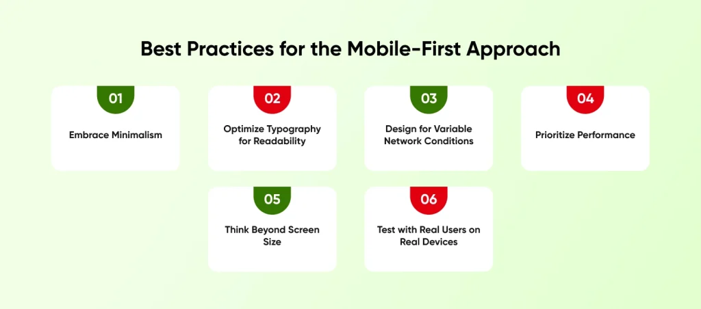
Adopting mobile first and responsive web design involves adhering to several mobile UX best practices that ensure optimal user experiences across devices:
Embrace Minimalism
Declutter and reduce non-essential elements to focus on what truly matters to users. The idea is to be intentional about every element included. Remember that each component adds to cognitive load and potentially slows performance on mobile devices.
Optimize Typography for Readability
Use legible fonts at appropriate sizes (minimum 16px body text) with sufficient contrast. Line heights should be generous (1.4-1.5) to improve readability on small screens. Use limited font families to reduce load times while maintaining your brand identity. Look for companies that provide end-to-end front-end development services that handle all such elements.
Design for Variable Network Conditions
Many mobile users experience inconsistent connectivity. Implement offline capabilities where possible, use skeleton screens during loading, and ensure critical functionality works even in low-bandwidth situations.
Prioritize Performance
Aim for sub-3-second load times on mobile devices. Optimize images, minimize JavaScript, leverage browser caching, and implement code splitting. Google’s Core Web Vitals provide excellent metrics to target when implementing mobile first responsive design.
Think Beyond Screen Size
Consider other mobile constraints like battery life, processing power, and touch as the primary input method. These factors should influence your design decisions as much as the viewport dimensions when creating mobile first responsive web design.
Test with Real Users on Real Devices
Conduct usability testing specifically with mobile users to identify pain points unique to mobile contexts. Observe how people hold their devices, use your interface while distracted, and navigate through key flows in various environments.
Mobile-First Indexing: What Role Does IT Play?
Google has a detailed guide about mobile site and mobile-first indexing best practices. This showcases the impact of mobile-first design on search engine optimization and rankings. Here are some important best practices for achieving mobile-first indexing for your project:
| Optimization Area | Short Description |
| Page Speed Optimization | Improve mobile load times that boost rankings using Core Web Vitals. |
| Responsive Images and Media | Optimized visuals improve UX and performance. |
| Touch-Friendly Navigation | Buttons that are easily clickable or tappable, help reduce bounce rates and improve engagement. |
| Content Parity | Ensure mobile content matches desktop for indexing. |
| Simplified Information Architecture | Easy site structure helps search engines rank pages effectively. |
Top Designer Tools for Achieving Mobile-First Design
Webflow
Webflow’s responsive design features enable designers to build fully customized, production-ready websites with its visual editor. Its breakpoint system allows precise control over mobile layouts, while its flexbox and grid tools simplify responsive component creation without coding. Make sure to hire Webflow designers with relevant experience in building mobile-first app designs for your specific industry or requirement, to get the most out of this platform.
Figma
Figma’s collaborative interface design platform excels at mobile-first workflows with responsive layout features and device preview options. Designers can create component variants for different screen sizes and leverage auto-layout to build flexible UI elements that adapt seamlessly across devices.
Adobe XD
Adobe XD streamlines mobile-first design with powerful responsive resize options and artboard presets for various devices. Its repeat grid feature and component states system make designing consistent mobile interfaces efficient, while prototype preview mode lets designers test mobile interactions instantly.
Bootstrap Studio
Bootstrap Studio provides a visual interface for responsive website design services using the mobile-first Bootstrap framework. Its drag-and-drop components automatically adapt to smaller screens, with built-in preview modes for various devices and integrated responsive grid system controls.
Final Words
Implementing mobile first design to your web apps and other digital assets can make significant improvements in visual impression, conversions and overall performance. Make sure to design with purpose and eliminate the clutter to focus on engagement-driven and valuable content. Inquire with biz@cmarix.com to get a detailed strategic roadmap for implementing mobile-first design with most efficiency.
FAQs on Mobile-First Design Services
How Does Mobile-First Design Improve User Experience?
It improves functionality of the app which in turns results in improved user experiences. High-performing mobile optimized web apps result in faster loading times, streamlined navigation and focused content.
What Is Mobile-First Design?
Mobile-first design focuses on prioritizing essential content and functionality first at mobile level, and then adding more elements for screen size. This helps make content-critical choices, leading to overall improvement in user experience and conversion rates.
What Industries Benefit Most From Mobile-First Design?
Industries with high mobile usage rates like retail, and travel can benefit from mobile-first design. Businesses that depend on local search traffic also gain significant advantages, as do healthcare providers and financial institutions where users increasingly expect to perform complex transactions on mobile devices.
How to Design Mobile-First on Bootstrap?
To design mobile-first on Bootstrap, start by using the smallest viewport size in your HTML structure and apply the default (non-breakpointed) classes first for mobile layouts. Outsource to a custom web development company that can use Bootstrap’s responsive utility classes with breakpoint prefixes (sm, md, lg, xl) to progressively enhance layouts for larger screens, rather than using breakpoints to fix mobile issues.
How to Design Mobile-First on Webflow?
To design mobile-first on Webflow, begin by switching to the mobile viewport in the Designer and creating your base layout structure and styles there. Define your core styles, spacing, typography, and component designs at this smallest breakpoint before moving to tablet and desktop views.