

User Interface (UI) can decide the fate of your application or website. It can do both: convert the visitors into your buyers or make them leave. If your UI is easy, efficient, and responsive enough to enhance users’ experience, they may end up being your customers. On the flip side, if your UI isn’t good, it will dissuade visitors from using it, and they may never turn back to you.
With the increasing pace of innovations and disruptive technologies, the business world is getting more competitive every passing day. Also, hundreds of your product’s substitutes are already competing in the market. Given these circumstances, losing a visitor to a competitor means a significant loss that no one wants to incur.
Hence, to help you retain your visitors until they convert, we have brought the 7 golden rules of UI design. In this article, we will explain the 7 rules that will help level up your UI design:
- Incorporate the fundamentals
- Let the control be at the user’s fingertips
- Set predefined shortcuts for the frequent users
- Provide feedback to every user input
- Lessen the user’s memory load
- Make the UI consistent across all the lineup/pages
- Incorporate ways to handle trivial errors
Prologue
In simple terms, User Interface (UI) is the user’s first impression of viewing an application. Before it’s even launched, the UI can tell the user that the application will visually be intuitive, easy to navigate, and fun to use.
However, there is a lot more to know about UI, but we have restricted this article to the rules of UI design. If you want to learn about UI in depth first, we recommend Maze’s user interface design process.
1. Incorporate the fundamentals
So, first things first: start with the fundamentals of your UI design. Be it anything, the fundamentals are always crucial, and skipping them will never take you to the intended destination. We should not go against the tides; hence, we should follow the fundamentals as described under:
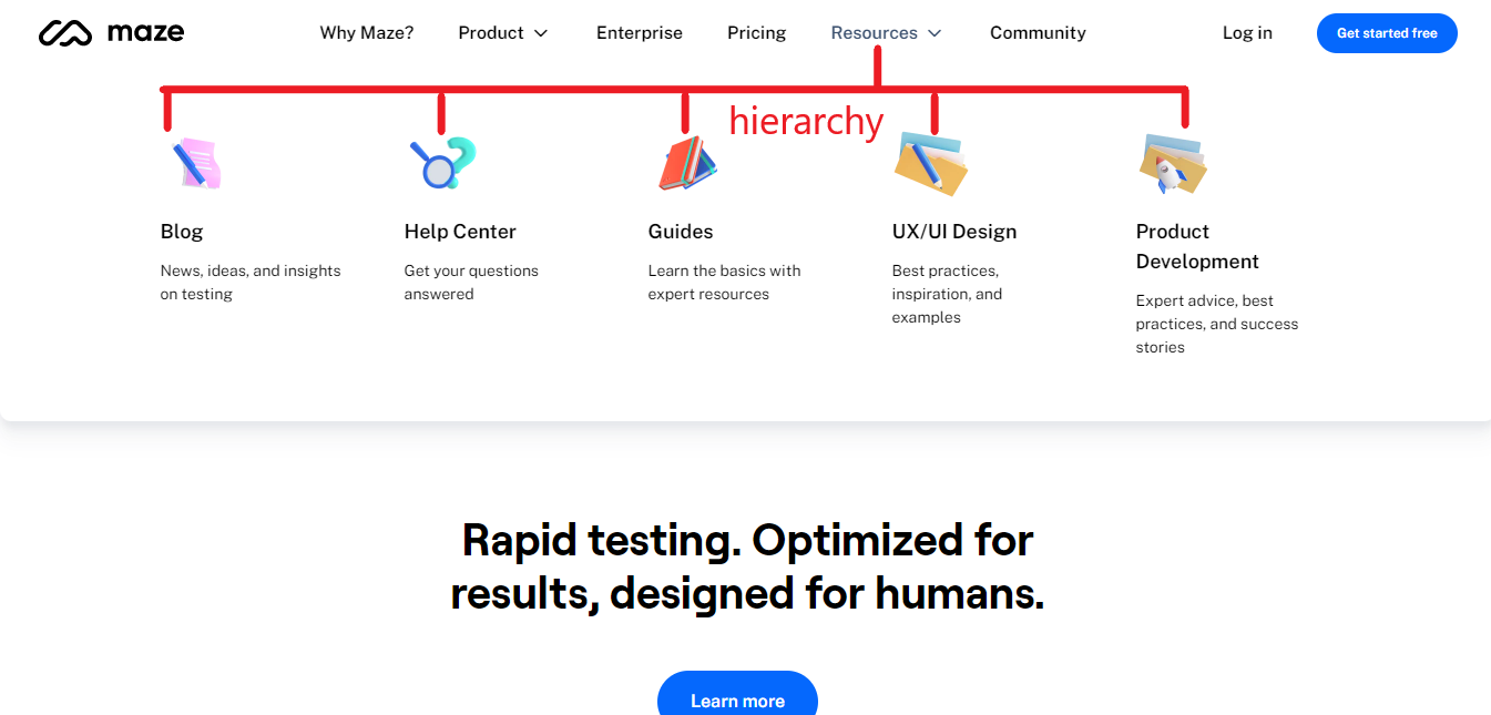
Visual Hierarchy
You should structure the content of your website or application hierarchically. When visitors land on your main page, try not to overwhelm them with everything you’ve got on board, especially when you are an ecommerce platform with tons of categories.
Let’s continue with the example of an ecommerce platform. You must have a main page that should only disclose the key highlights of your website and the options to move to the other head pages if the visitors want. For instance, the main page may have the path only to the purchasing page, about us page, blog page, terms & conditions page, etc.
Afterward, if your visitors have come with the purchase intent, they will click on the purchase page. When they land there, every selling item should not be scattered all over the place rather it must be well-structured.
For instance, create a hierarchy of subcategories such as health & wellbeing, electronics, toys, etc., under the main purchasing category. Then, further divide each portion if possible, like the electronics sub-category is divisible into mobile phones, laptops, printers, etc.
White Space
Unlike its name, white space is the blank space between text, graphics, or other elements on your platform regardless of its color. If the background of a website is black, and if it is left blank between the elements, that will be its white space.
White space is essential in design, and it’s an easy way to improve the legibility of your design. To create a better design, you can use small, empty spaces between lines, paragraphs, or menu items as white space.
Color & Contrast
Choose the color of your UI wisely as it reflects your brand persona. Colors influence the perception of humans about you; hence, choose it accordingly. For instance, as per the studies in color psychology, black color creates a perception of luxury.
Similarly, you must choose a color, and use it across the whole UI that best reflects your brand. Also, you must create a distinguishing contrast between the color of your font and the white space; the blend of both may obstruct readability.
Read More: UI/UX Design Trends: Top 7 Trends to Watch Out
Alignment
Do you want to distract your visitors? No? Then better align the content in your UI. The best thing you can do for alignment is to use a grid system to help you align elements on the page. Aligning elements on a page helps create a clear connection between them, and it is one of the most important principles to remember.
2. Let the control be at the user’s fingertips
You must have a flexible UI design that doesn’t direct your visitors; instead, the opposite is correct. To elaborate, your UI should not direct visitors to perform a task unless they desire.
The control of the UI must be in the user’s hands. If they want to leave the platform, the UI should facilitate their desire. If they want to undo/redo a state, your UI should facilitate that. Similarly, you can incorporate such minor tweaks into your UI’s design that let the control be at the user’s fingertips.

3. Set predefined shortcuts for the frequent users
If your application or website is used frequently by the users, it must have some predefined shortcuts to repetitive tasks. For instance, many applications such as Google’s Docs are used frequently by their customers.
In such applications, the users develop an unstated need of not doing repetitive tasks manually again and again; hence, the shortcuts work wonders here. For your frequent users, you must incorporate shortcuts in the UI as Google Docs has done.
For example, if the user copies and pastes the items in your application frequently, make it easier for them by specifying the shortcuts such as Ctrl+C and Ctrl+V, respectively.
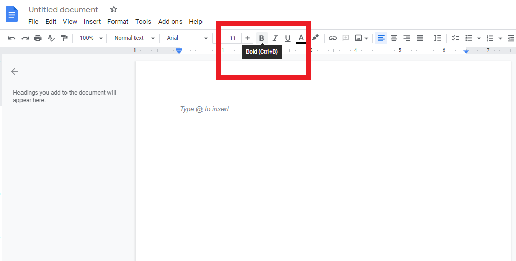
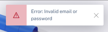
4. Provide feedback to every user input
For every user action, there must be a reaction to confirm that the action is being executed. That reaction can be anything from a change in the pressed button’s color or a prompt confirming the actions.
However, according to the ui/ux designers, the rule of thumb is that if the action is modest, the reaction must also be modest. Whereas for a peculiar action, a peculiar reaction is required.
To illustrate, if a user has clicked on the ‘about us’ page, the reaction to confirm that their action is being executed can be a loading animation or just a loading cursor. Similarly, if a user has entered a new password that doesn’t meet the specified criteria, the reaction can be a pop-up to indicate what’s missing.
5. Lessen the user’s memory load
Your UI design should be simple and easy-to-use, not sophisticated. A sophisticated application incorporating multiple different things may cause a load on the user’s memory to remember them. Ultimately, they may abandon it and shift to a substitute. Since you don’t want this, lessen the user’s memory load.
You can do it in many ways. For instance, when creating shortcuts for repetitive tasks, make those shortcuts easy to remember and use. A generally used shortcut key for saving activities across many applications is Ctrl+S. The designers set this specific key because:
- It has the first letter of the word ‘Save’ to make it easy-to-remember
- It is generally used across all platforms for the same purpose
Similarly, try to lessen users’ memory load so they don’t feel burdened when using it.
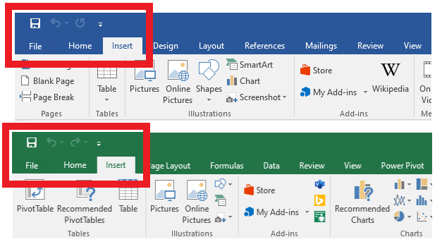
6. Make the UI consistent across all the lineup/pages
A consistent UI contributes to the ease of use of users. If it is a UI for a website, all the pages should have the same layout, font, and place of general commands. If you have a lineup of products that complement each other such as Microsoft’s Office Suite, the UI in all of the applications must be as consistent as possible.
7. Incorporate ways to handle trivial errors
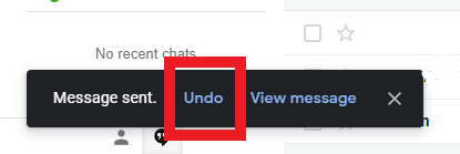
Errors are inevitable; hence, there should be a way to rectify them. If your users make errors, you should design your UI that doesn’t make them feel worried. The UI should provide accessible, in-built remedies to amend those errors.
An excellent example of it is the ‘Undo’ function of Gmail while sending an email. Sometimes, we just miss attaching the files in an important email and press the send button. For the ease of users, Gmail provides a time of a few seconds to undo that email and amend it.
Similarly, your UI should also have such remedies to the potential errors users can make.
Conclusion
It’s exciting to see how UI design has evolved over the years. Undoubtedly, it has become complex with the changing preferences of users. To ensure that you can tackle this complexity, we showcased the rules of a great UI design.
We hope you enjoyed our article about the 7 golden rules of UI Design. It can be tricky to build a UI that truly represents your company and one that your customers will use. So, for your UI design to be a success, make sure you follow these golden rules.