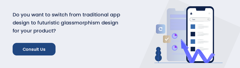
We all know that the user interface (UI) is a critical element of any digital platform or app solution. It is also the most trending element that constantly keeps changing. Over the years many UI trends have come to the fore only to get replaced by another design trend. Skeuomorphism dominated the UI landscape and was replaced by flat design with minimalist elements. Then we have a material design that once again brought the gradients and shadows back into the design landscape with a minimalist twist. Glassmorphism happens to be the latest trend in user interface design that has experienced huge popularity in a short span of time. Already Apple, Microsoft, and several other leading brands, as well as prototype design companies in the USA, have embraced UI/UX design trends.
What Is Glassmorphism? What Are Its Key Features?
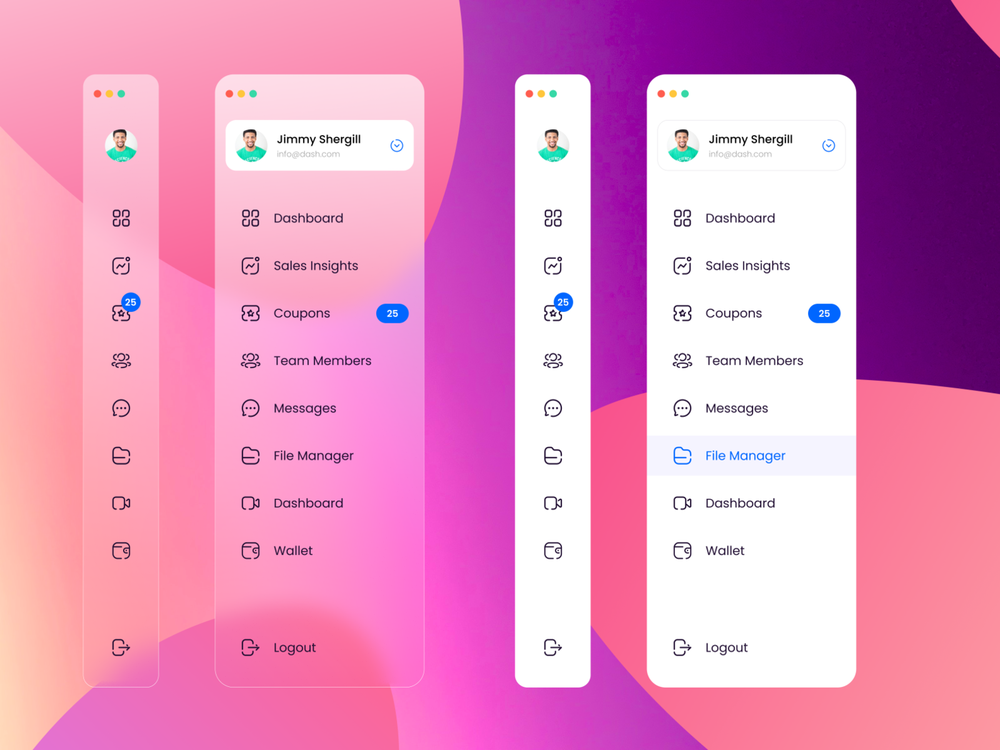
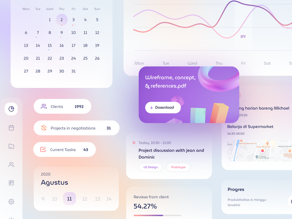
Glassmorphism as we have explained is the latest and trending UI design principle. It is a subset of the design principle called Neumorphism or design that imitates the actual object from surrounding for a more objective grounding. Glassmorphism by taking this principle actually incorporates the glass-like effects in the look and feel of the interface. The key features of Glassmorphism are the following.
- It creates a sense of transparency by imitating a virtual glass and the resulting background blur effect.
- It offers a highly multi-layered approach that may create the look and feel of floating objects at certain times.
- Additionally, the blurred effect of the design gets a further boost by the use of vibrant and lively colors.
- We can observe a subtle border appearing on the edges of the translucent objects.
Read More: 7 Common UX Design Errors That Every App Project Should Avoid
From Background Blur To Glassmorphism: A Happening Story
Background blur effect first came into being way back in 2013 when iOS 7 was launched. The change was generally welcome with the only controversy remaining about the new fonts and not so beautiful icons. The fading icons in the background when you pull the notifications became a popular UI change that Apple created in years.
But instead of getting old and outdated, this blurring effect was once more introduced by Apple with Mac OS Big Sur. Though one can easily turn off that effect in the system settings, it already received good appreciation and is likely to stay there as part of the Apple ecosystem for some time.
Recently Microsoft also brought this design element in their Fluent design system. The translucent look and feel rightly named by Microsoft as Acrylic is nothing but an extension of this design principle called Glassmorphism.
The worldwide popular platform Dribble that showcases the design works from all over the world has already given place to many design works following Glassmorphism. From transparent frosted-glass effect to vivid pastel colors and use of light border, the Glassmorphism design principle is seen working across app interfaces in various measures. Naturally, when you hire UX designer india, you cannot leave aside this new design skill from your considerations.
How To Achieve The Perfect Glassmorphism Effect In Design?
Now let us guide you about using this design principle for coming with the desired effect. When you use the design in a card-based layout, remember the attraction of light is proportionate to the closeness of the object. So, in a card-based design layout, the appearance is likely to be a little more transparent.
The effect in totality is shaped by a combination of effects such as shadow, blurring of the background, and transparency. Creating a balance of translucency and blurring effect accentuated by the colors, light, an outline is a key to the design.
Setting Perfect Transparency Level
As we have said you need to create the right balance between transparency and blurring effect. When the design ensures optimum transparency, the blurring effect will completely go away.
Setting The Right Background
Creating the right background is important to help the effect come with the desired look. Remember, too much detail in the background is not expected for the right effect. On the other hand, make sure the background is not too bland or dull. Colorful background with less detail and more vibrancy will be great for the blurring effect.
Using The Border In Outline
One more thing that this design principle allows you to use is a 1p inner border along with some level of transparency for the shape. Creating a simulation of the glass-edge it easily helps in making the design stand apart from the surroundings.
Ensuring Optimum Accessibility
There is one major problem with this design principle and that is regarding the accessibility of the design. Just like Neomorphism, the Glassmorphism as a design principle doesn’t make the design as accessible as the Material Design. People having vision issues can experience real problems with the Glassmorphic user interface.
How can you still use this design principle in a balanced manner to maintain accessibility? Well, if you use the blurring effect and glass-like appearance almost in every design element, this can really make your design inaccessible for people having problems with vision or eyesight.
Actually, the guiding principle is to avoid the blurring or transparent effect altogether in areas that require active interactions. Don’t use this design aesthetics in buttons, toggles, navigation menu, and similar elements. Instead of using transparency and blurring effects for decoration purposes, use them sparingly to give a boost to the overall look and feel.
To ensure accessibility further, always ensure maintaining proper contrast with the cards in interfaces while creating the right spacing between the cards and grouping together all the objects related to one another. Creating the right contrast and intuitive grouping of cards in the design layout can easily dodge accessibility issues of Glassmorphism.
The Future Of Glassmorphism
Apple introduced this design style into Mac Big Sur is a clear testimony that the design principle is going to be a mainstay in the scheme of things for UI design. With the push of Apple and Microsoft, this design principle is all set to take on the prevailing popularity of the Material Design principle.
How you use this design principle to the advantage of the usability of your app is going to be the most important aspect. While the design trend for some years slowly started to move towards the imitation of natural objects or simulation of real-life objects, Glassmorphism is the natural outcome of the design evolution. Obviously, this will give birth to new twists and experiments in the years to come.
Conclusion
No design principle is permanent and everlasting and Glassmorphism in that regard cannot be an exception. But as per the present state of things in digital design, it has just become a new trend embraced by big and small brands alike. We expect a lot more to come through the twists and turns of applying this design principle in actual projects.