
Everything has a color. whether you intend to see a thing in any particular color or not, it already has a color. But in the highly competitive world of business where every other brand is chasing attention, color remains a crucial brand element. This is why most well-known global brands make an impression with their branding colors. Whether you step inside their offices or stores, buy products shipped or handed over in their own packages or use their business mobile app, you find a consistent color scheme representing the brand in everything. So, the choice of color really plays an elementary role in branding.
As business mobile apps serve as extensions of the digital brand presence, color scheme as in all other brand-specific interfaces and deliverables plays an important role for mobile user experience as well. So, you are less likely to choose different color schemes for your business store and mobile app. On the other hand, when choosing a color scheme for your mobile app UI you need to give particular attention to the specific UX related constraints. This is why for any
Android App Development Company building mobile apps for business brands attention to color scheme is a must.
We need to start by explaining the basic color theory and how it affects the users emotionally.
Basic Color Theory
Anyone having been a student of art have some understanding about how different colors contradict or complement each other. If you observe a color wheel, you will notice that the opposite colors actually complement and deliver a better visual balance. Look at the color scheme used in the app design of the leading brands including Kindle, Google, Uber, and countless others. Yes, most of them conform to this norm of using opposite colors to create better contrast. Strong contrast is also chosen by most apps when showing notification badges.
Now, let’s come to the colors that sit next to each other in the color wheel. Well, they are called analogous colors. These colors boasting of least contrast are actually helpful when you need to create a sense of harmony and continuity. For instance, meditation and relaxing apps like Calm uses analogous colors like blue and green that instantly create a sense of harmony and peace.
In this regard, color theory always insists that using analogous colors should be taken with extreme caution as such uses can actually decrease the readability of the copy. Moreover, on a mobile screen, two low contrast color selection can make readability of text doubly difficult due to the similarity in colors and small screen size.

Creating the Right Feel for Your Brand
What you think of a brand in clear terms may not always represent what you feel about a business brand. This is why color scheme is essential to create the right feeling about your brand that instantly makes an impression. This feeling subtly works deep inside your brain without information having anything to do with this. Actually, this feeling at times bigger influence in pushing sales than mere what you think about the business brand in clear terms. This is why a favorable color scheme that creates the right first impression is so important.
Another important thing is that at times repetition of the colors within an interface actually boasts of the brand-specific feeling. Just think of any instance when you have not seen the logo of Facebook or Twitter appearing with a color scheme bereft of the shades of blue associated with their brands. Similarly, you can’t think of Coke without red and Uber without a black and white color scheme. Such repetition of the colors actually insists on the association of the respective color scheme with the brand.
Some of the key areas where the repetition of the brand-specific color scheme will happen include logo, business website, storefront, mobile app UI, product packaging, promotional materials, advertisements, e-commerce shop design, third party store interface like that of eBay, etc.
How to Choose the Right Color for Your Brand?
Now, we have come to know about the utilization of the color scheme for your business brand and how it makes an impact on your business brand. Now, we need to see how a business should choose specific colors for representing its brand identity. Well, you cannot switch to different choices of colors everyday and hence you need to make a decisive choice once and for all.
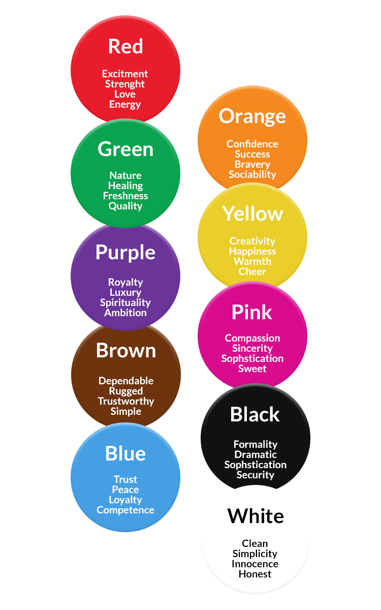
The effect of different branding colors is different on the customers and your prospects. To understand the impact of the various colors, let’s have a look at the emotional associations of every major color.
- Red: Red boasts of passion, anger, and excitement. It is capable to drive attention and to create an air of significance.
- Orange: Orange boasts of strength, friendliness, and playfulness. It is also capable to boost confidence and evoke energy.
- Yellow: Yellow is the color of happiness, optimism, and youthfulness. It is also widely used along with other colors for grabbing attention.
- Green: Green is the color of stability, groundedness, natural connection, prosperity, and growth.
- Light Blue: The lighter shades of blue flaunts a feeling of peace, tranquility, trust, and openness. It is also used to signify innocence and being unadulterated and fresh.
- Dark Blue: Dark blue primarily stands for professionalism, security, trustworthiness, and formality.
- Purple: Purple is the color used for signifying luxury, affluence, royalty, and creativity.
- Pink: Pink stands for effeminacy, youthfulness, and innocence. As per the context of uses, it also boasts of luxury and modern approach.
- Brown: Brown is the color of vintage mood, ruggedness, earthiness and old-fashioned feeling.
- White: White is the color of cleanliness, simplicity, virtue, and health.
- Gray: Gray is a color for neutrality. Depending upon contexts of uses it can deliver a subdued, classic, serious, mature or mysterious feel.
- Black: Black signifies power, sophistication, and enigma. Depending upon the context of use, black is also a color to boast of a feeling associated with luxury and modern feeling.
Now, when it is about picking the right color scheme for your brand, there are no ground rules for every business brand or UI-UX services to follow. It depends upon your niche, the kind of association you already developed with your customers over the years and the kind of reactions you expect from your audience. When picking colors, remember the following aspects.
- Choosing 3 colors for the base, accent and neutral color is suggested for any brand color scheme. Even if you choose a largely monochromatic color scheme, you will need some variation.
- The base color should be chosen as per the most important aspect of your brand personality and the target audience. Other two colors need to be chosen based on this base color.
- Accent color you need to use most after the base color. The accent color should represent the second most dominant aspect of your brand personality besides creating the right contrast with your base color. Mind the rule of color wheel in this respect.
- The neutral color is most likely to be used just as the background color is chosen mostly to avoid distraction or unnecessary attention. The purpose of neutral color is to draw attention to the foreground instead of the background.
Now, let us explain 4 different categories of color schemes for your branding efforts. Let’s explain them one by one.
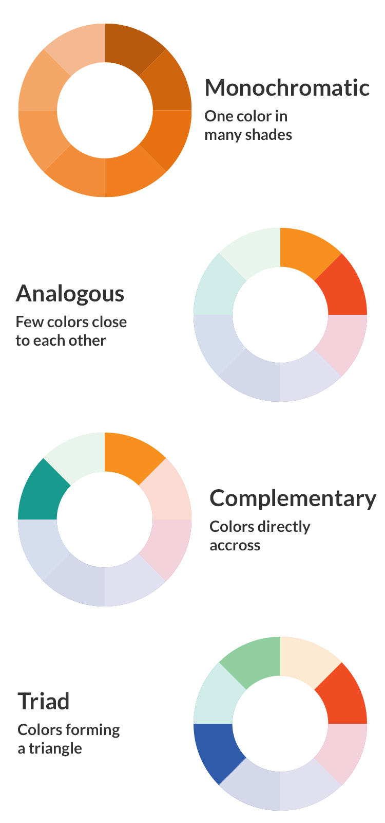
- Monochromatic: When the color scheme wants to focus on one brand personality, you generally opt for a monochromatic color scheme. Though it fits the personalities of many minimalist brands, there are lots of challenges for creating the right contrast without really stunning the audience.
- Analogous: Colors sitting close to each other on the color wheel boast of closeness, harmony and least contradictions. This is why analogous colors are safe to avoid negative emotional reactions. On the other hand, the analogous color scheme is not great for drawing attention or for visually standing out.
- Complementary: Complementary colors are the opposite colors in the color wheel and which goes with one another best for drawing attention and for visually standing out. By standing opposite to one another they actually bring out the best of one another. Complementary colors are very popular and this is why you need to utilize them with caution lest your color scheme doesn’t look similar to any other.
- Triadic: This color scheme puts together colours from 3 separate areas of the colour wheel. It is capable to boast of a visually attractive variety but offers optimum stability like analogous colour scheme. But when bringing them together you need to see whether all three colours actually represents some aspect of your brand identity.
The colour scheme should represent a brand in its entirety and showcase different aspects of the brand personality in a coherent manner. The colour scheme for your brand may start with the logo but over time it should expand across all other interfaces and areas where your brand is directly communicating with its customers and target audience.
Different Colour Schemes for Different Industry Niches
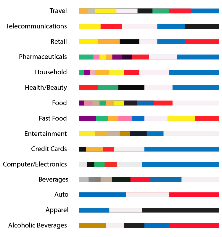
Just as every industry niche address audience in a specific manner, every one of them has its own mood and tone. This is why a banking app cannot have the same look and feel as a restaurant app or a garment store. The dominant colour scheme for every niche is different. Let us explain this with some examples.
- Financial and Banking: Finance and banking sector needs to build trust and reliability more than anything else. They also need to invoke professionalism, clarity of thought and straightforward approach. Hence, Blue as the accent colour and White as the base colour are so popular for this sector.
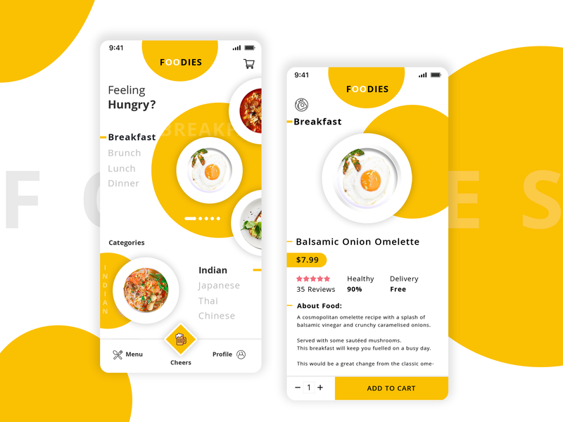
- Food and Restaurant: In food and restaurant niche the most popular colours are red, yellow and green as the accent or base colours while black and white are mostly used in the background to make the forefront look more colourful and visually stunning. Red evokes hunger, yellow creates a happy feeling while a little spark of green used in food images enhances freshness.
- Hospitality: When it comes to hotels, you have a broad range of colours at your disposal. The brown brings a sense of comfort for accommodation, while for spa and pool you can use comforting shades of blue and green and for food courts and cafeteria you can use more warm colours.
- Construction: For construction, evoking energy and passion is important while you also need to create a sense of comfort and reliability. These three elements are best represented by orange, brown and sparse use of blue. For eco-homes and projects with an emphasis on greenery and nature, mingling the natural elements in hues like green and blue can be effective as well.
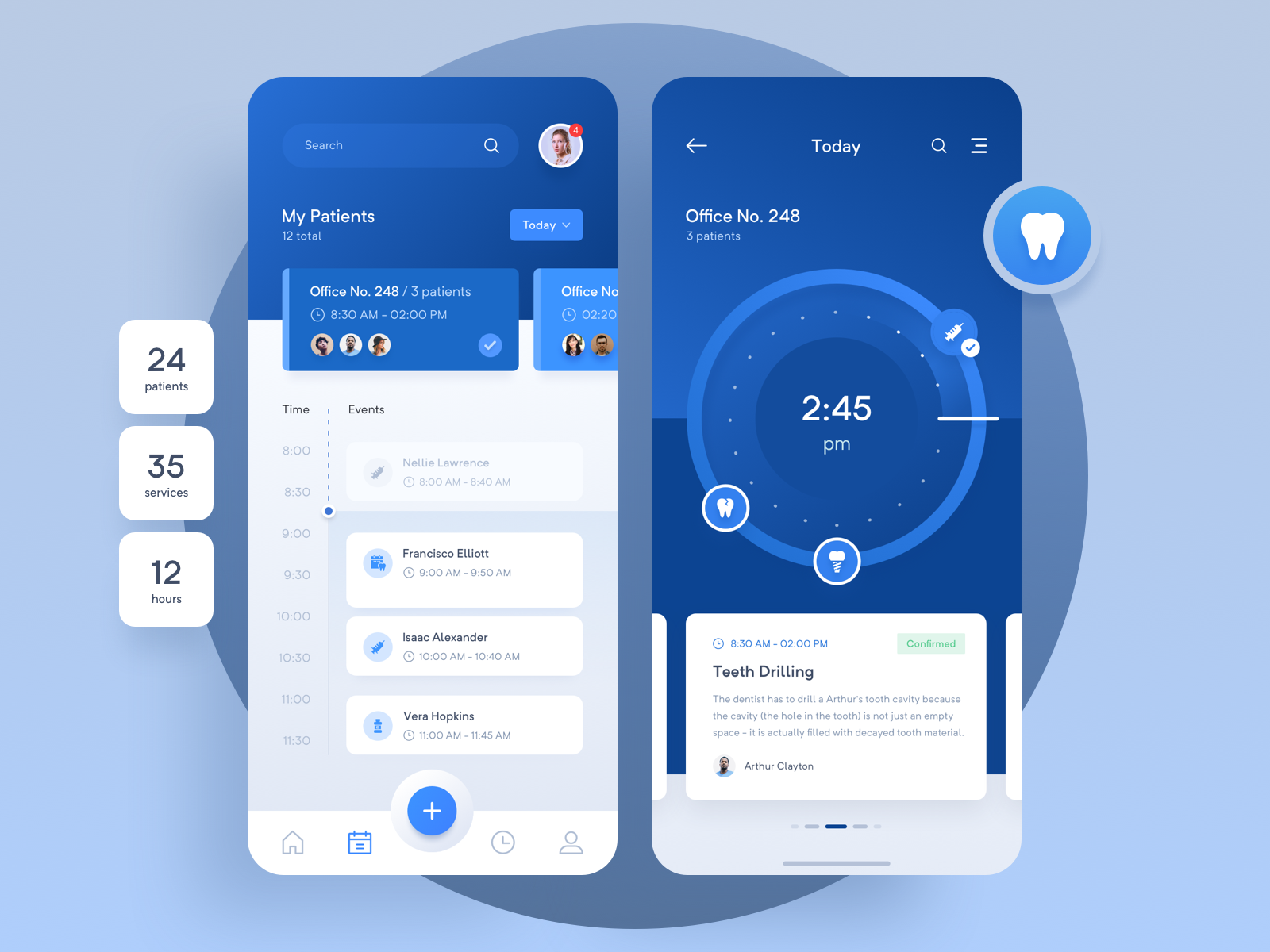
- Healthcare: Healthcare websites and apps mostly use a blue and white colour scheme to signify trust, reliability, and peace of mind. As a background sparingly you can also think of using grey as a neutral colour evoking a sense of credibility.
Key tips for Utilising Colour Scheme for Business Mobile Apps
Let’s start with the very basic aspect. Colour scheme for a business app serves the same purpose as it serves to the business website or storefront of that brand. So, once the brand colours are decided, they need to be incorporated across all interfaces.
But if you are a startup and are just launching a new mobile app for the brand, you may be more likely to take a decision about the colour scheme for your business brand as well as the new mobile app. For such a startup business, mobile apps let us provide here a few effective tips.
Ensure Emotional Responses
We all know that colours are equally cultural attributes and consequently creates different cultural connotations for different groups of people. This is why the use of colours doesn’t follow any universal principle. When using colour for a business app you need to keep the demographics of the target audience in mind.
Know Your Audience
Just because evoking an emotional response from the audience is important for a mobile app, it is very important to have a solid grasp on the demographics and psychology of the intended audience. When you research well about the colour preferences of the target audience, the UI resonates better with the audience.
Learn from the Competition
It is quite likely for your competitors to target the same audience as your business app. This is why it would be always beneficial to analyse and learn from the colour scheme from your competitors. While you should always offer a UI with a different colour scheme compared to your competition, at least you can learn from their sense of proportion or harmony.
Always Put Yourself in the Customer’s Shoes
Instead of choosing a colour scheme that seems to be right from your own perspective, while choosing the colours put yourself in the customer’s shoes. Always think what kind of response a particular colour scheme can draw, whether you use it in mobile apps or as part of your business website.
Don’t Hesitate to Experiment with Colours
Last but not least of advice will be to experiment with the colour scheme from time to time. If your competitive brands are using almost the same type of colours with some variations here and there, you need to stand apart from such brands by using a slightly different colour scheme while confirming the core values or colour significance.
Remain Consistent Throughout
When creating the right colour scheme for your business app and other interfaces you should also insist on being consistent throughout. Consistency in respect to colour scheme is all about maintaining the same base, accent and neutral colour throughout. Since colour scheme is an integral part of your business brand, inconsistency will ruin the branding effort.
Conclusion
For business mobile apps choosing the right colour scheme is akin to making the most important choice to represent a brand visually. If you are going to connect to your audience principally through a web or mobile app interface, the visual impact of the colours on your audience should be given foremost priority.