Quick Summary: This blog covers the top UI design trends of 2025 that are redefining digital experiences. From dark mode and AI integration to micro-interactions and minimalist layouts, we cover all the latest UI design trends that focus on usability, emotion, and smarter design. Whether you’re a designer or a business, these insights can help you stay ahead.
Let’s be honest, predicting UI design trends isn’t like having a crystal ball. What we do have is a front-row seat observing how users interact with digital products. Some of these UI design trends and patterns are impossible to ignore.
Whether you’re a seasoned creative or a company looking to hire UI/UX designers, staying on top of the latest trends isn’t optional. It’s your survival kit in today’s fast-paced, competitive landscape.
We’ve identified eight current UI design trends that keep showing up like that friend who arrives uninvited but somehow makes the party better. These aren’t just aesthetic choices, these modern UI design trends are strategic moves that can make or break user engagement.
Current and Raising Graphic Design Market Share and Size
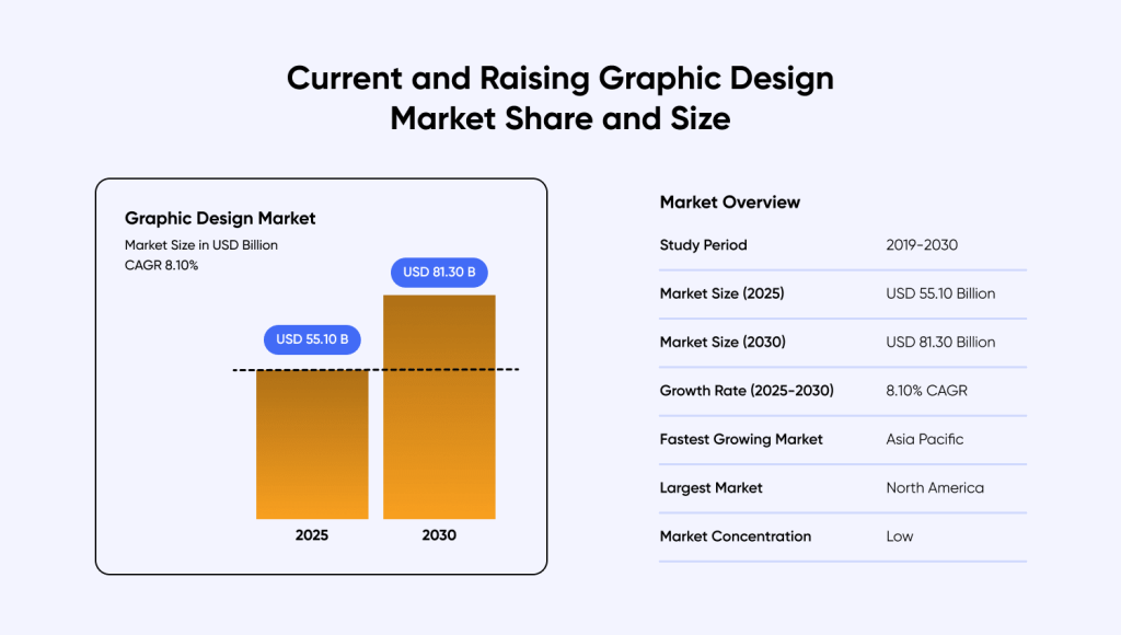
The digital design world is growing at lightning speed, faster than a designer on their third espresso before a deadline. The overall market share for graphic design market size sits at USD 55.10 Billion in 2025, and is expected to be valued at USD 81.30 Billion by 2030. Out of this, online design platforms enjoyed a 64.3% share of such graphic design services in 2024.
8 Latest UI Design Trends To Follow in 2025-2026
Identifying the latest UI trends is not just about what are the most common patterns seen in the UI/UX industry. It is looking beyond the popularity, and diving deeper into the intent, purpose, philosophy and other factors surrounding a design trend.
Any design movement needs to leave an impact, solve a practical problem, be flexible, and provide room for growth, in order to truly be deemed as one of the UI design trends 2025. If you are looking for UI/UX design services, it is important for you to go through these top 8 latest UI design trends to understand what you should be looking for:
| Trend | Description | Why It Matters |
| Dark Mode with Accents | Uses dark backgrounds with vibrant color highlights | Enhances focus, reduces eye strain, and adds a premium feel |
| Data-Driven Dashboards | Clean, visual-first dashboards for better data interaction | Improves decision-making with organized, user-friendly layouts |
| Minimalist UI | Simplicity with purpose, removing visual clutter | Boosts clarity and keeps users focused on content |
| Micro-Interactions & Animations | Small animations that provide feedback and guide users | Increases engagement and improves usability |
| Neumorphic Design Elements | Adds depth to flat design for a tactile feel | Bridges physical and digital interactions |
| AI-Integrated UI Design | Seamless AI features that feel natural, not robotic | Enhances user experience with intelligent, helpful interactions |
| Responsive & Adaptive Design | Tailors layouts for different devices and usage contexts | Ensures consistency and usability across screens |
| Emotion-Centric Design | Designs that connect emotionally through visuals and tone | Builds trust and creates more meaningful user experiences |
1. Dark Mode Design Trends: How Vibrant Accents Are Transforming UI in 2025-2026
Dark mode has evolved from a developer preference to one of the most loved current UI design trends in 2025, with users across all demographics embracing this interface approach. By definition, dark mode is a display setting that changes the colour scheme of any application or device interface from a light accent background like white, to a dark coloured-background like black or dark gray, with contrasting light coloured text.
Did You Know? Spotify nailed dark mode early with their interface that makes album artwork pop like it’s under stage lights. X (formerly known as Twitter) followed suit, and suddenly everyone realized dark backgrounds weren’t just for hackers.
However, successful dark mode implementation requires more than coating a black background on your webpages or mobile apps. An effective dark mode design uses carefully selected color palettes that maintain visual hierarchy and readability.
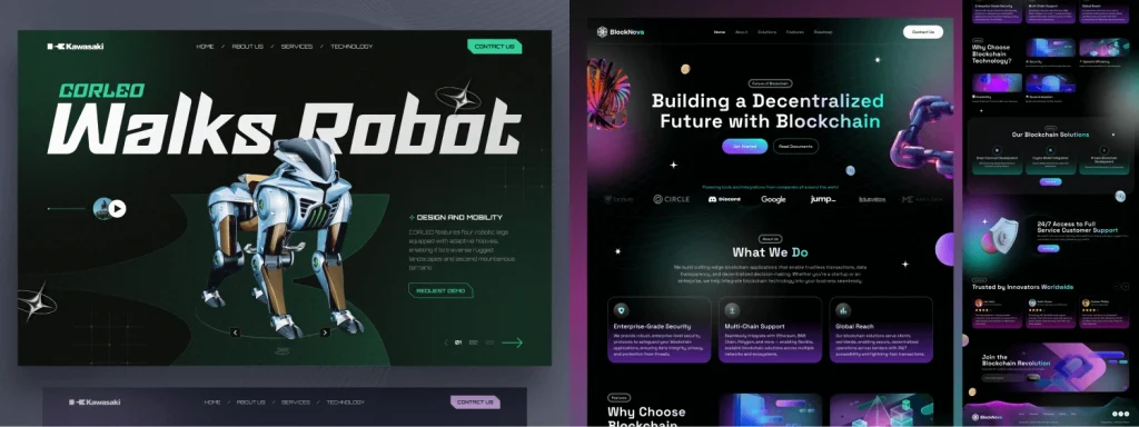
Take this design for blockchain platforms using electric blues against charcoal. It creates that “future” vibe without making users squint. Or futuristic automotive interfaces where neon accents complement the high-tech environment.
Dark interfaces convey premium quality while strategic color highlights create engaging user experiences that encourage continued interaction.
2. Data-Driven Dashboards: Making Spreadsheets Appealing
If you’ve stared at dashboards that look like Excel threw up on your screen, you know why this trend exists. Traditional dashboards overwhelm users with poorly organized data presentation, creating barriers to effective decision-making.
Slack’s analytics dashboard is the best real-world UI design trend example for this trend. They took mind-numbing statistics and made them actually viewable. Notion does the same, turning data into stories instead of number soup. These data visualization best practices truly improve data scalability and ease of gathering relevant insights, particularly valuable for businesses using mobile app development services for analytics platforms.
Effective Dashboard UI/UX Design Principles
- Progressive disclosure: Present information in proper order to prevent cognitive overload.
- Card-based layout: Organize content in digestible sections for better breathability.
- Mobile-first thinking: Ensure accessibility across all devices and contexts.
Real-time updates: Keep them smooth, non-disruptive so they don’t cause seizures.
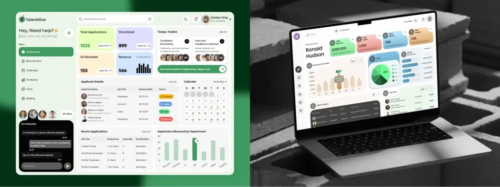
This recruitment platform admin dashboard design has cracked this, it takes candidate tracking nightmares and making them feel like browsing Netflix. Some well-designed CRM interfaces now adapt based on what you need, not what the database contains.
3. Minimalist UI Trend: Less is More (But More is Complicated)
Minimalism is having a moment, but let’s be clear: minimalists should not be treated as “my intern designed this during lunch.” True minimalism is like a perfectly tailored suit; all elements serve a purpose.
Apple didn’t invent minimalism, but they made it profitable. Their product pages are masterclasses in purposeful simplicity. Every white space and font choice calculated to make you want that shiny device. This led to a trend where all tech and digital marketing companies began looking to hire UI/UX designers who could replicate the minimalist aspect of Apple’s design to promote their brand as forward-thinking and minimalist.
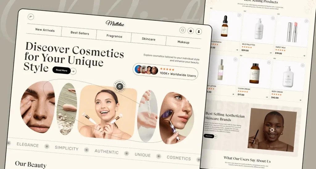
Some eCommerce site designs on Dribbble get this, when selling visual products, visual noise is your enemy. The design gets out of the way and lets products be stars. The intent of a good design is always to drive users to the product/service and engage with the content, not overwhelming them with loud and distracting visuals. This is a principle that’s especially important in mobile app design services where screen real estate is limited.
Pro Tip: The difference between minimalist and bland design is personality. Smartly designed energy dashboards prove you can be clean, functional, and still have character.
4. Micro-Interactions and Animations: The Devil’s in the Delightful Details
Micro-interactions and animations are important in modern mobile app development trends. They make apps feel smoother and add life to static elements. Simple effects such as a button pulse or even a sliding menu guides users and give quick feedback. These small details can make a big difference in the overall experience.
Latest UI Design Trends: Instagram Pull-to-Refresh MicroInteraction
Instagram’s pull-to-refresh wasn’t accidental. Those bouncy, satisfying interactions keep you scrolling because they make refreshing feel rewarding. The entire microinteraction can be broken down in three parts –
- Initial Pull: When the user pulls down the top most part of the feed, the content moves upwards mimicking a pulling effect.
- The Loading Ball: As the user releases the feed from the “pull”, a quick subtle loading animation in the form of a spinning circle appears. This acts as a visual cue that the feed is loading.
- Content Refresh: The loading animation stays on for a couple of seconds even if the user doesn’t let go of the pull, refreshing the content in microseconds, and the animation disappears instantly.
This makes the boring practice of feed refreshing a rewarding experience for users, that keeps them hooked for longer durations. Genius or evil? You decide.
Business applications prove micro-interactions’ worth. With thoughtful animation, they make boring tasks feel almost pleasant. Smooth transitions help users stay oriented when switching contexts.
Reality Check: Performance beats flashy effects. This habit tracking app nails this balance by providing meaningful feedback without overloading system resources.
5. Neumorphic Design Elements: When Your Interface Hits the Gym
Neumorphism is what happens when flat design wants a bit more personality. It adds just enough depth to buttons and controls to make them feel almost real, without going overboard like the heavy shadows we saw back in the early 2000s.
Think of Tesla’s in-car screens. The controls look like you could actually press them, blending the feel of real-world objects with the sleekness of digital design. It works because we naturally understand things we can almost touch. That little bit of depth helps users connect with the interface in a more intuitive way.
Tesla’s in-car interfaces pioneered this. Those touchable-looking controls bridge physical and digital perfectly. We’re hardwired to understand physical objects better than flat shapes.
The catch: It’s easy to mess up spectacularly. Neumorphic design requires careful implementation to avoid visual confusion.
Audio interfaces feel natural because they mimic device physicality. Smart home controls show selective application works, using dimensional effects for the interactive elements while maintaining flat design elsewhere.
6. AI-Integrated UI Design: How Artificial Intelligence Is Enhancing User Interfaces in 2025
AI integration is like introducing your best friend to your family, it can go really well or really awkwardly. The challenge isn’t making AI work; it’s making it feel natural instead of robotic, a consideration that is reshaping mobile app development trends across industries.
ChatGPT’s interface looks like basic chat, but that simplicity does heavy lifting. They could’ve gone full sci-fi but made it feel like texting a smart friend. Slack’s AI features follow similar design philosophy, natural workflow extensions, not alien add-ons.
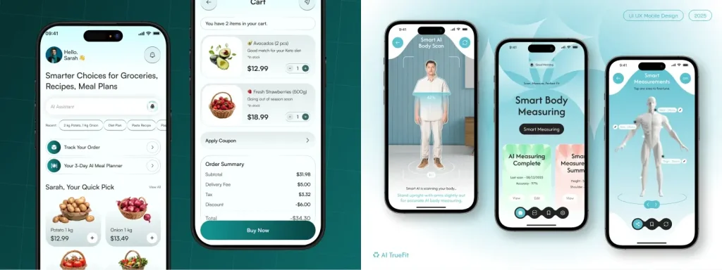
This smart grocery platform uses AI for product suggestions and optimization but presents features through familiar shopping patterns. Similarly this measurement app succeeds by being upfront about AI capabilities and limitations.
For businesses considering AI integration, working with experienced teams that offer mobile app design services, ensures these features improve rather than complicate the user experience.
7. Responsive and Adaptive Design: One Size Fits All (Finally)
Responsive design grew up. It’s not about squishing desktop layouts onto phones anymore. Instead, it’s about creating experiences that make sense for different device usage patterns. This is becoming a core principle that is driving modern mobile app development trends.
Netflix figured this out years ago. Desktop focuses on browsing, mobile prioritizes “continue watching,” TV interfaces suit lean-back viewing. Same content, completely different interaction approaches.
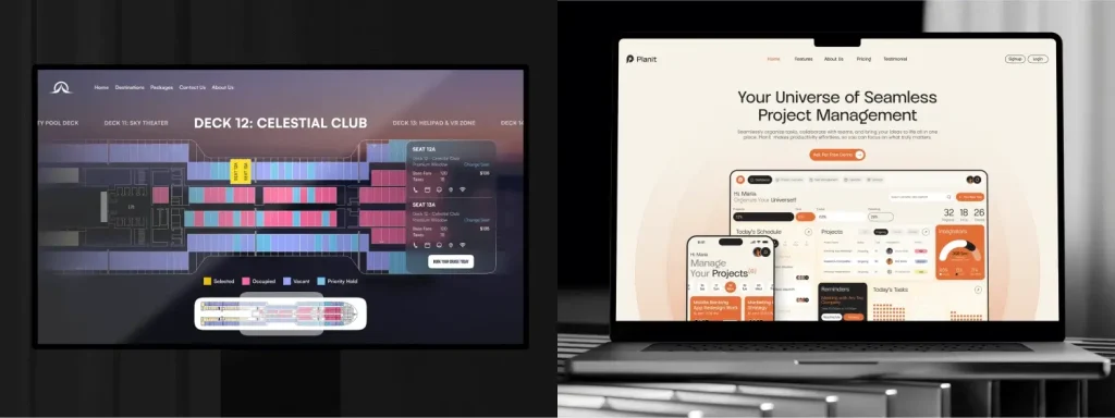
This cruise booking website design took it one notch further and transformed complex processes into streamlined mobile experiences without losing functionality. Also this project management tool design delivers app-like web experiences—best of both worlds.
8. Emotion-Centric Design: Applying Emotional Intelligence to Interface Design
Here’s something most design school doesn’t teach: users are humans with emotions, not logical decision machines. How interfaces make people feel matters as much as functionality.
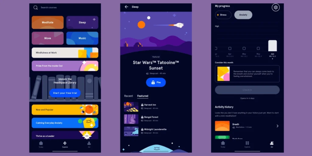
Image Source: Headspace Application
Headspace transformed meditation apps by focusing on emotional states over features. Their interface creates a calm mental state even before you start meditating. Duolingo’s passive-aggressive mascot motivates through guilt trips. Different emotions, same empathy principle.This mood recording app ui design creates safe emotional spaces using gentle colors and encouraging language. With different visual cues for different action items, it helps declutter and provide clear separations that helps the audience feel at ease while using the application. The fluid animations also help by providing a soothing effect.
The design of this period tracking app uses welcoming colours but also translates design language to text by using warm, inclusive language for traditionally clinical topics—the difference between feeling judged and supported.
Final Words
We can’t predict exactly where UI design heads since technology moves too fast, and half of today’s “revolutionary” trends might look outdated in five years (remember parallax scrolling obsession?).
What we know: Trends that stick solve real human problems, not just aesthetic preferences.
What Actually Matters:
- User needs trump trend adoption
- Accessibility makes designs better for everyone
- Real user testing beats designer assumptions
- Innovation works best building on familiar patterns
The best future UI designs will be ones users don’t think about, they’ll just work naturally, solving problems people didn’t know they had.
These eight trends aren’t fashion statements; they’re responses to evolving technology and human behavior. Understanding them isn’t about following checklists, it’s recognizing deeper patterns driving user expectations and business success.
FAQs on Latest UI Design Trends
How Do You Stay Updated on the Latest UI/UX Design Trends?
We follow leading design platforms like Dribbble, Behance, and Figma Community while analyzing user behavior data from top brands. Our team attends design conferences, participates in design communities, and conducts user testing to validate trend effectiveness. Staying connected with other designers and learning from real user interactions keeps us updated on evolving design standards.
How Do UI Trends Impact User Experience?
UI trends directly influence how users perceive and interact with digital products, affecting first impressions and engagement. Well-implemented trends like dark mode or micro-interactions reduce eye strain and make interfaces feel more responsive. However, blindly following trends without considering your specific users can harm usability.
Can I Use These Design Trends for My App or Website?
Absolutely, the key is to be intentional with how you use them. Rather than following all trends, think about what makes sense for your audience, your brand, and the purpose. Begin with one or two design elements, which improves the user experience. Focus on what adds value and supports your goals, it’s not about using trends just because they’re popular. It’s about making smart choices that work for your users.
What Are the Latest UI/UX Design Trends for Mobile Apps?
Current mobile app trends focus on dark mode with vibrant accents, AI-integrated interfaces, and emotion-centric design. Micro-interactions, smooth animations, and minimalist design dominate mobile experiences where screen space is limited. Neumorphic elements and responsive design are gaining traction among leading mobile app design services.